Creating a luxury brand for medical aesthetics leaders
Scroll down
introduction
Dr Woodward and Dr Manning were looking to take their aesthetics clinic to the next stage.
Having pioneered their own non-surgical facelift ‘The RiverLift’ and positioned themselves as the go-to experts in women’s health, they were looking for a new brand identity that reflected their expertise and their clients.
-
Client
River Aesthetics
-
Industry
Healthcare

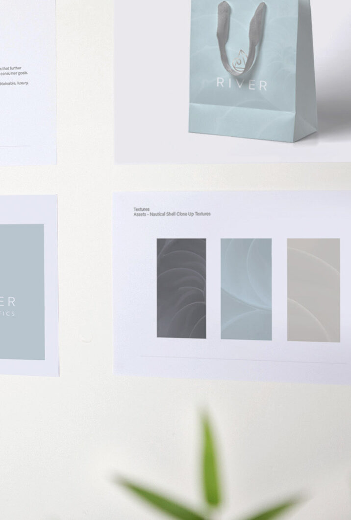

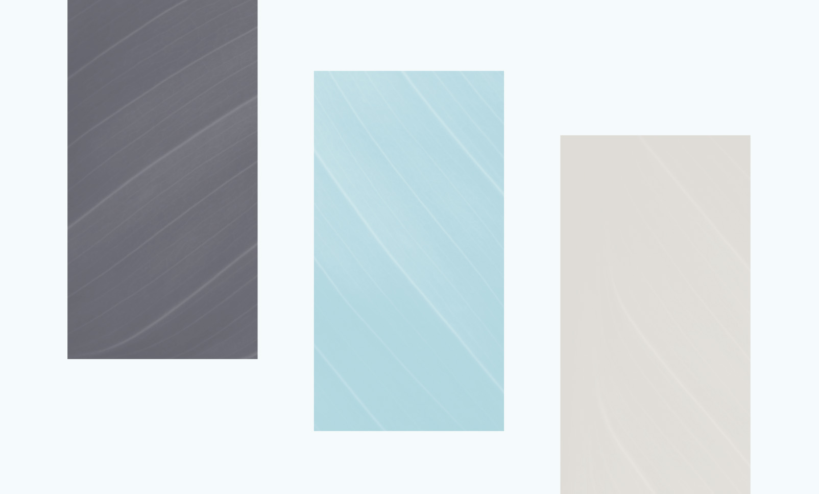
Textures and patterns
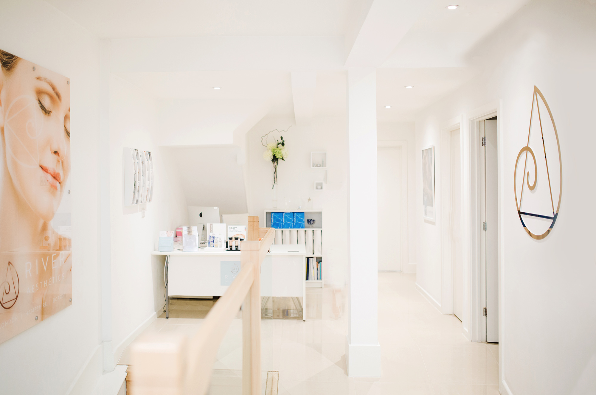
To combine the ideas of natural beauty with cutting edge medical techniques and expertise, we had to use patterns and textures to reflect these ideas at the same time. This is why we chose a logo incorporating a ‘Golden Ratio’ triangle and Fibonacci swirl to reflect mathematical precision but this ratio, particularly the swirl, exists a great deal in nature too. We used a metallic colour to represent the medical profession but in a muted natural colour to incorporate the natural beauty theme. Similarly, we used lots of natural textures and soft lines to reflect the subtle natural work River Aesthetics do.
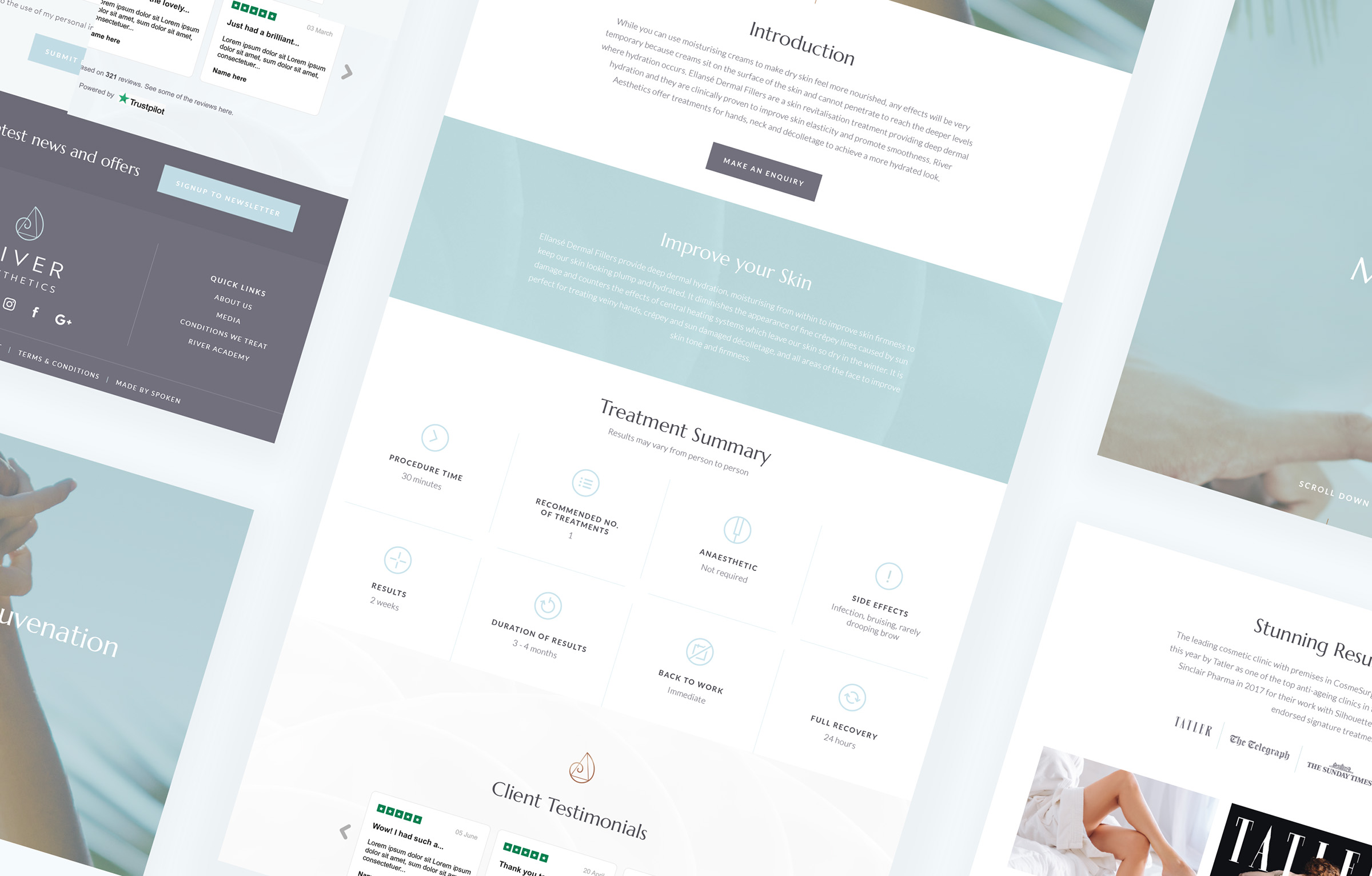
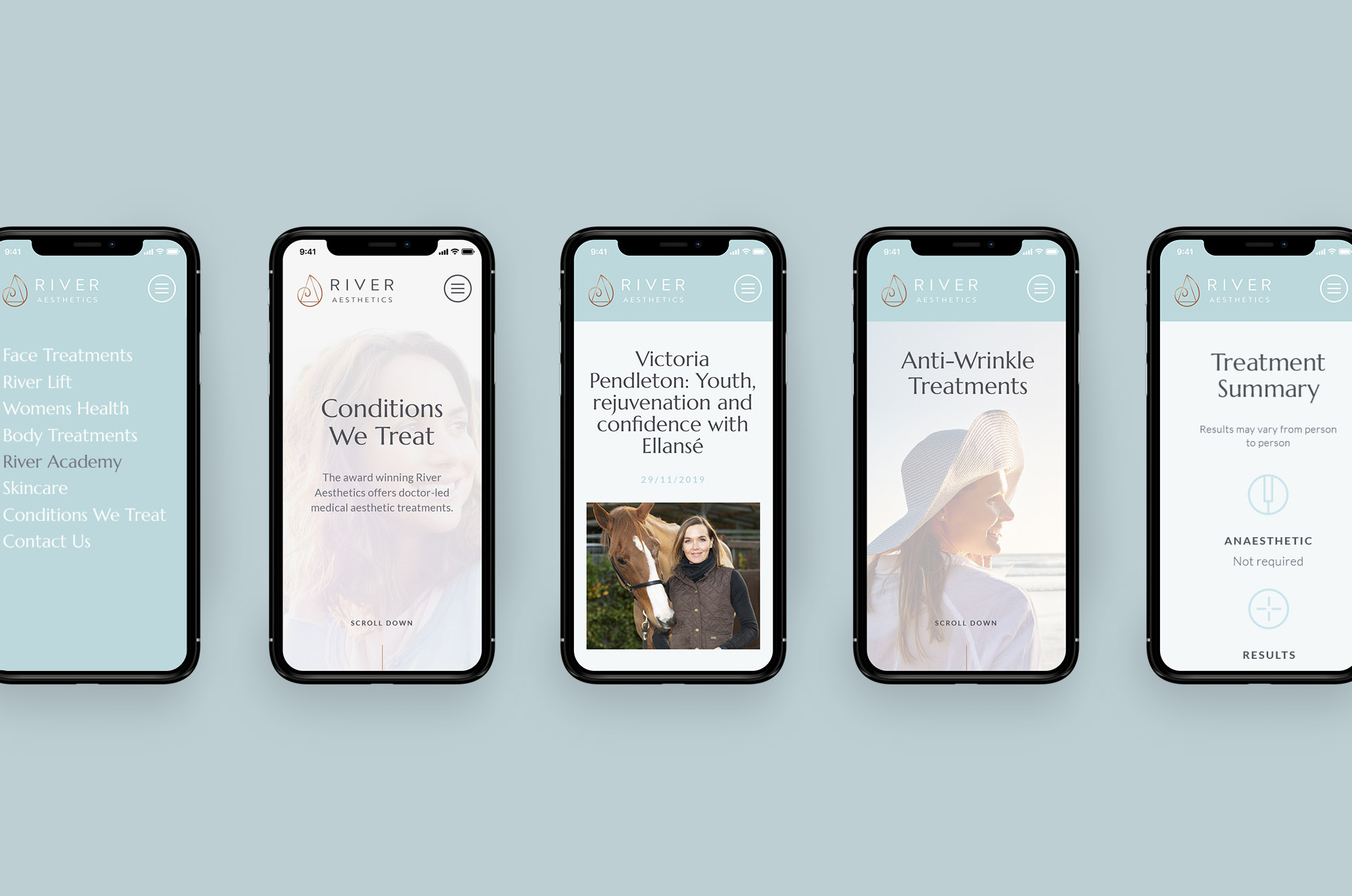
A suite of
responsive components
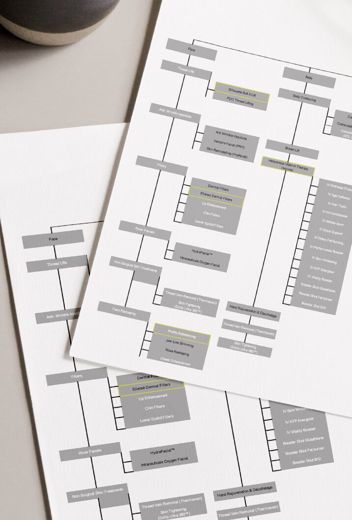
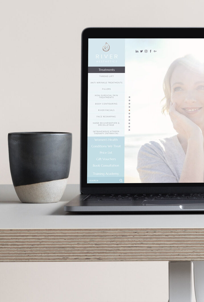
The images, logos, themes and colours we used to create River Aesthetics’ brand aren’t just for use on the website. We created assets that perfectly reflect the brand and can be used in print media, social media, emails, displays and anywhere else. Having this material ready to use or custom created by us for a specific purpose means the branding is consistent across every medium.
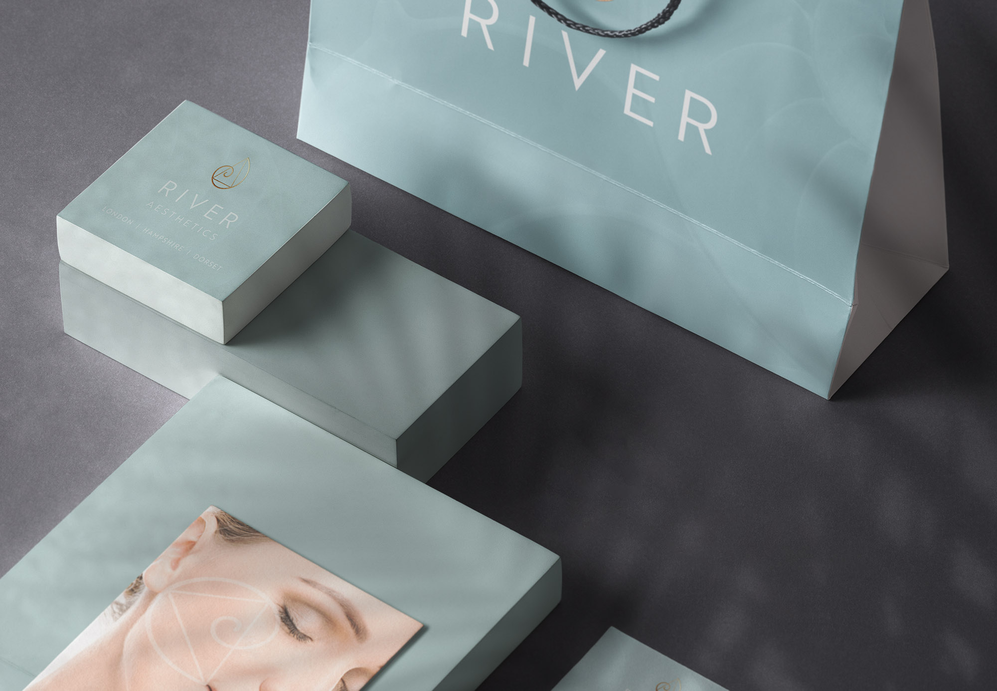
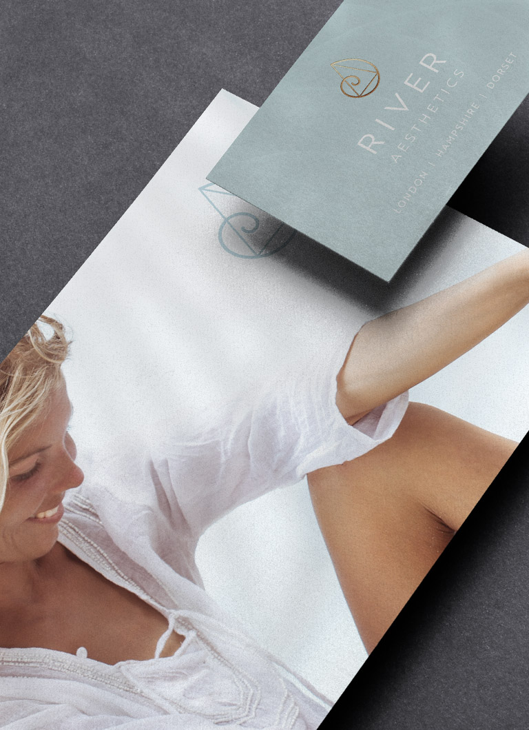
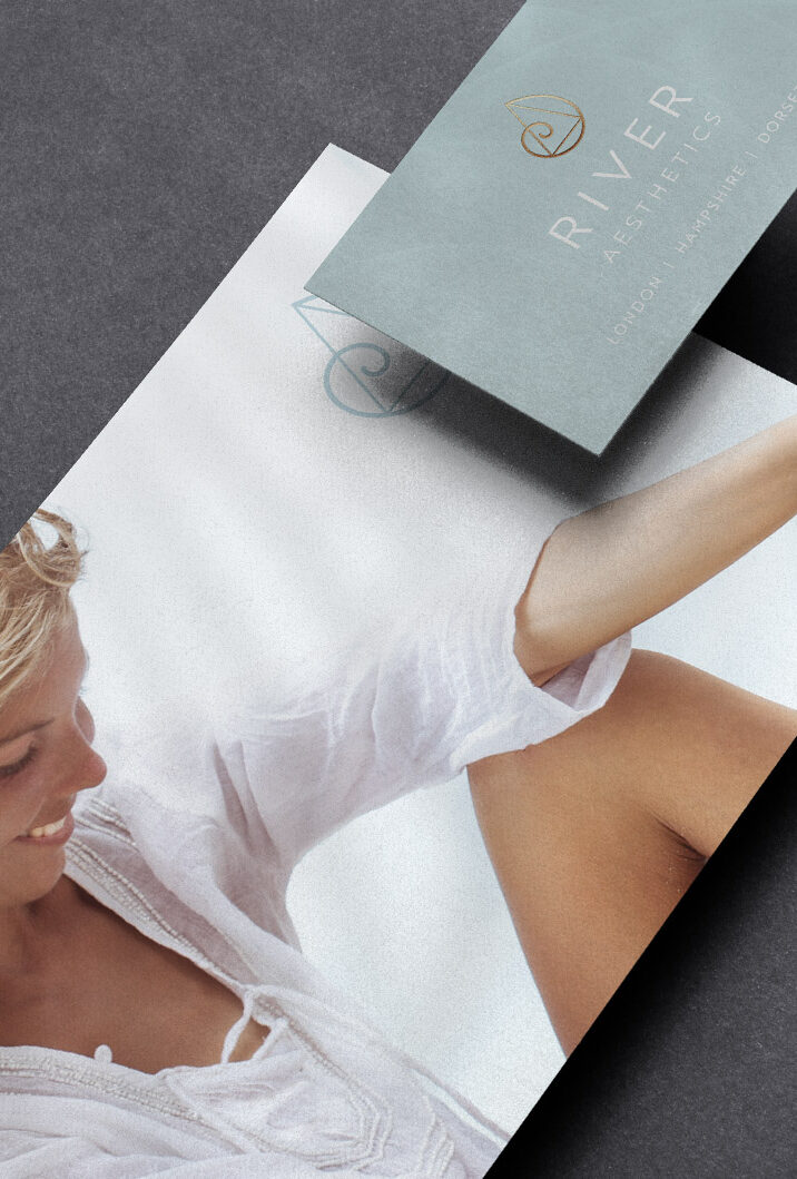
Print Design
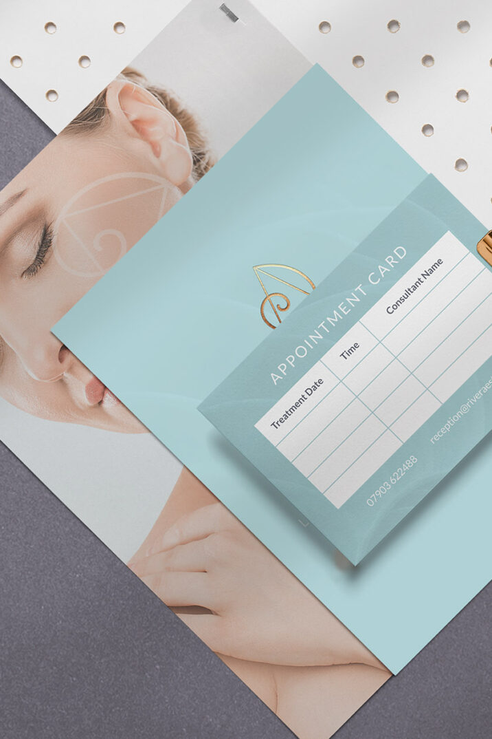
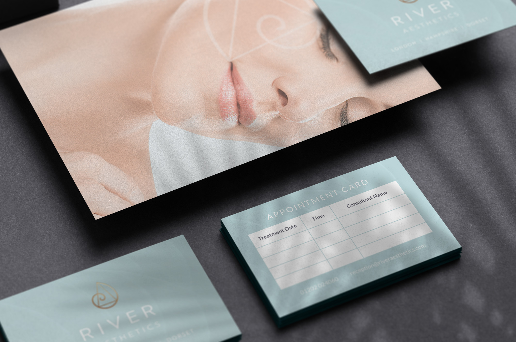
River Aesthetics’ metallic coloured logo looks particularly good in print especially next to the soft natural tones used in the rest of the branding. All of the printed material we designed was totally consistent with the online branding as we were aware from the start that they would need lots of brochures, etc. so their branding had to work well both online and in print.