Filter by:
-
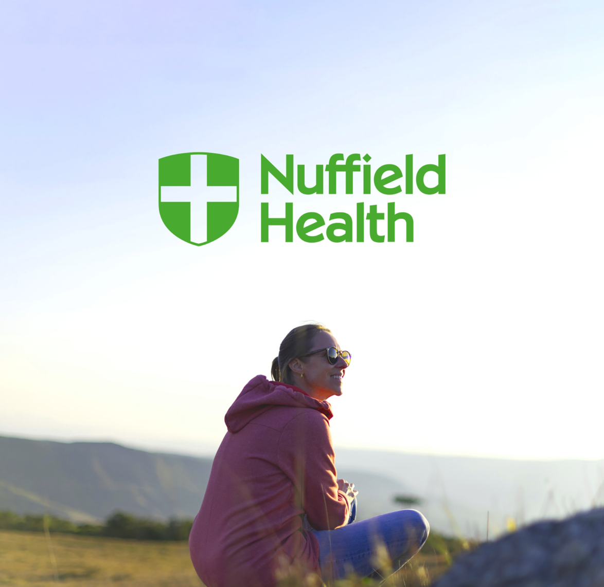
Nuffield Health
32% increase in patient enquiries
-


Medica
Recruitment enquiries up 43%
-


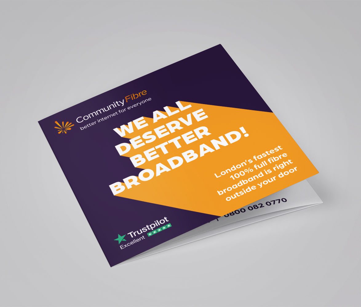
Community Fibre
Helping Community Fibre become the best internet provider for London on Trustpilot
-

Sight & Sound
Eye-catching campaigns and a new look for this independent business
-

Seven Integration
Bringing smart homes to life to increase conversions
-

Experience West Sussex
Supporting the growth of the West Sussex tourism economy
-

Posturite
Increased online revenue by 73% and an increase in overall ROI of 30%
-
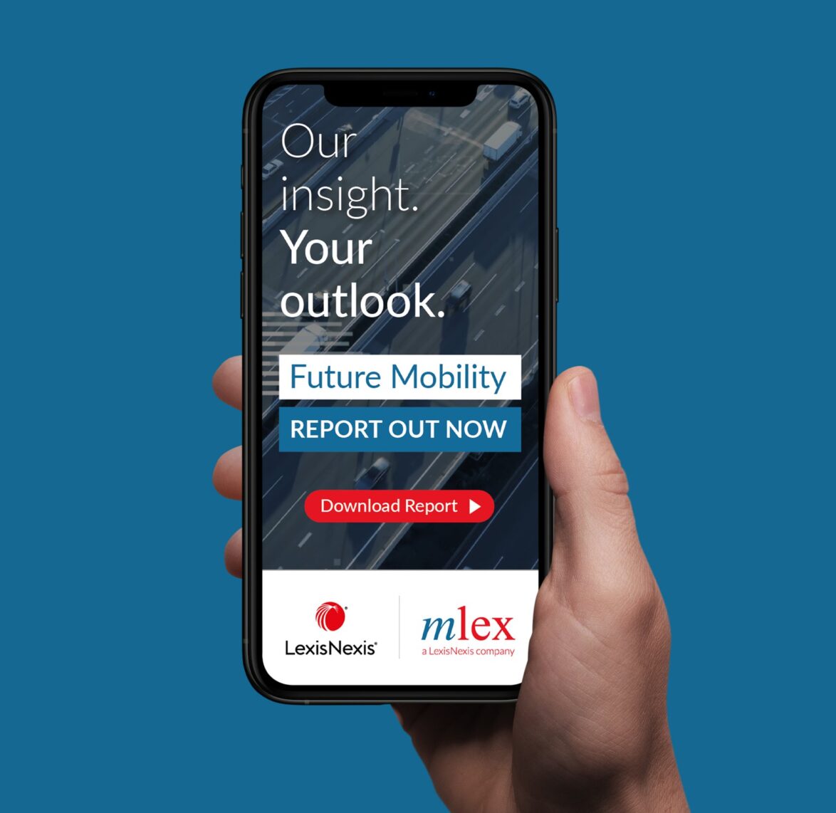
LexisNexis
Working with a leading global provider of legal and regulatory intelligence
-

Oakley
Helping Oakley become a household name
-
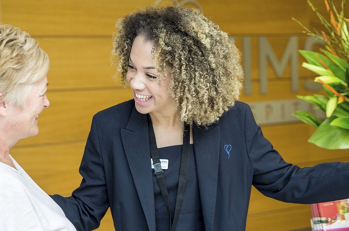
KIMS Hospital
Increasing overall website traffic by 26% in less than 12 months
-
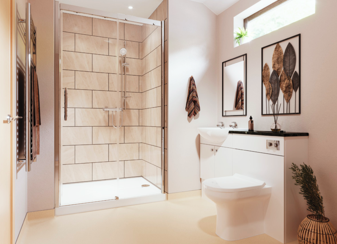
AKW
Developing offline and online assets across a whole host of campaigns
-
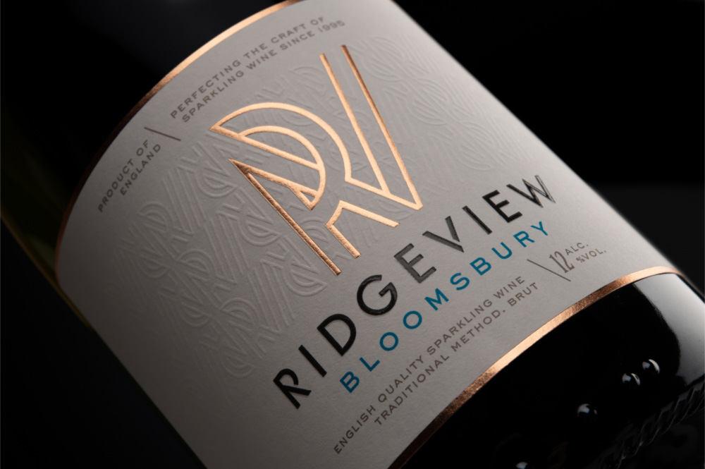
Ridgeview
Ecommerce revenue increased by 178%
-

ISUOG Virtual World Congress
Using a digital advertising strategy to promote the congress
-
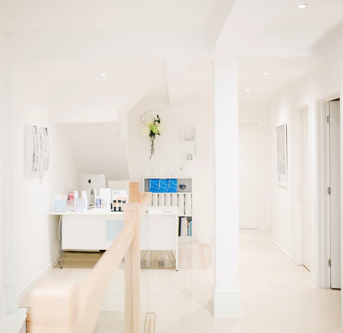
River Aesthetics
Creating a luxury brand for medical aesthetics leaders
-

G.H. Bass & Co
Organic revenue increased by 94%
-

WeThrive
Generated leads at conversion rates of 5.26% and 3.12%
-
Tapi Carpets & Floors
152% increase in home visit bookings from social media
-

Brighton Gin
Storytelling via a responsive eCommerce website
-
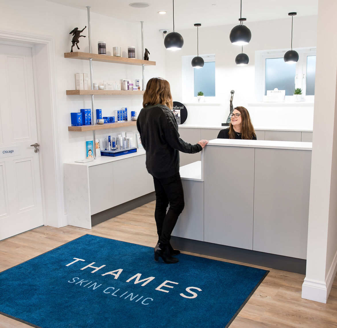
Thames Skin Clinic
A leading expert and doctor-led skin and medical aesthetic
-
Cooden Medical Group
New patients from the website increased by 76%
-
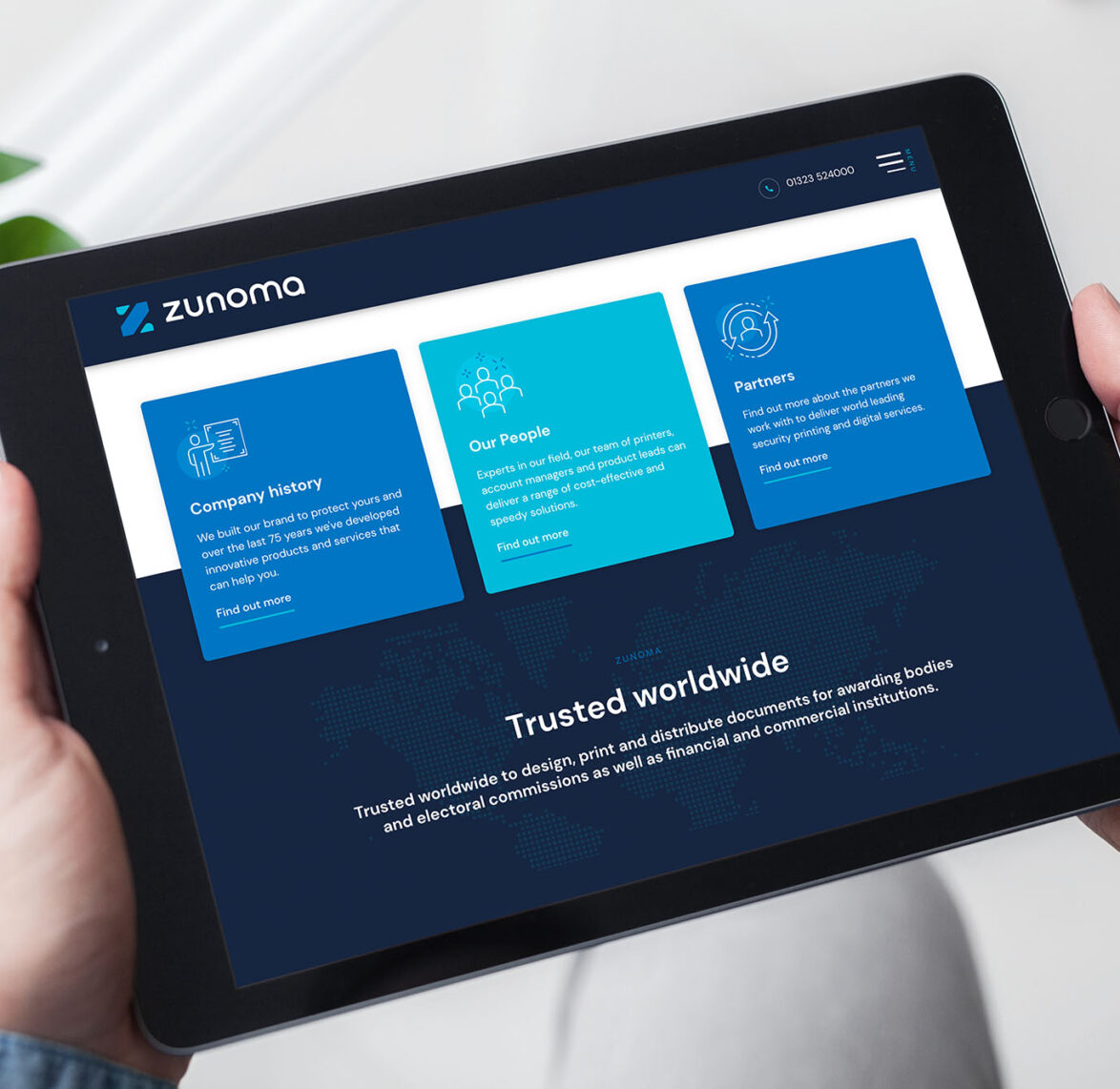
Zunoma
Repositioning a world leading security printing company
-
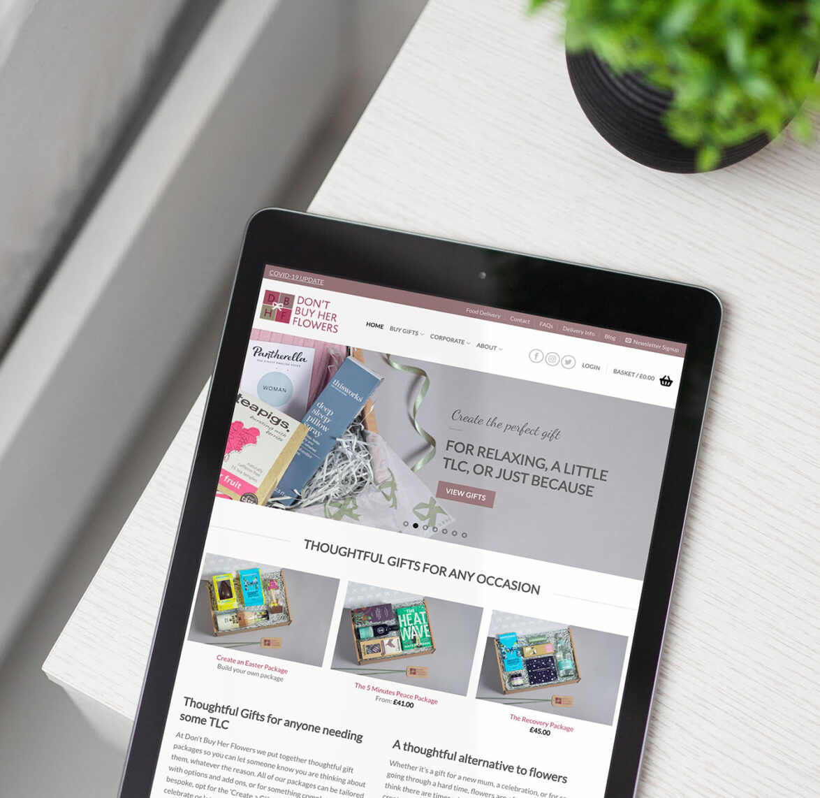
Dont Buy Her Flowers
62% increase in revenue and 120% increase in ROI within 4 months
-

The Telemarketing Company
65% increase in CVR from testing call to actions
-
Avantis Wealth
A rebrand to help give you more financial freedom
-
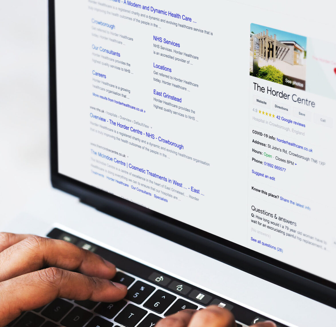
Horder Healthcare
16% increase in overall website enquiries
-
Community Fibre – Promotional Campaigns
Promotional Campaigns
-
The London Lingual Orthodontic Clinic
18% increase in website enquiries from PPC, with 20% less media spend
-
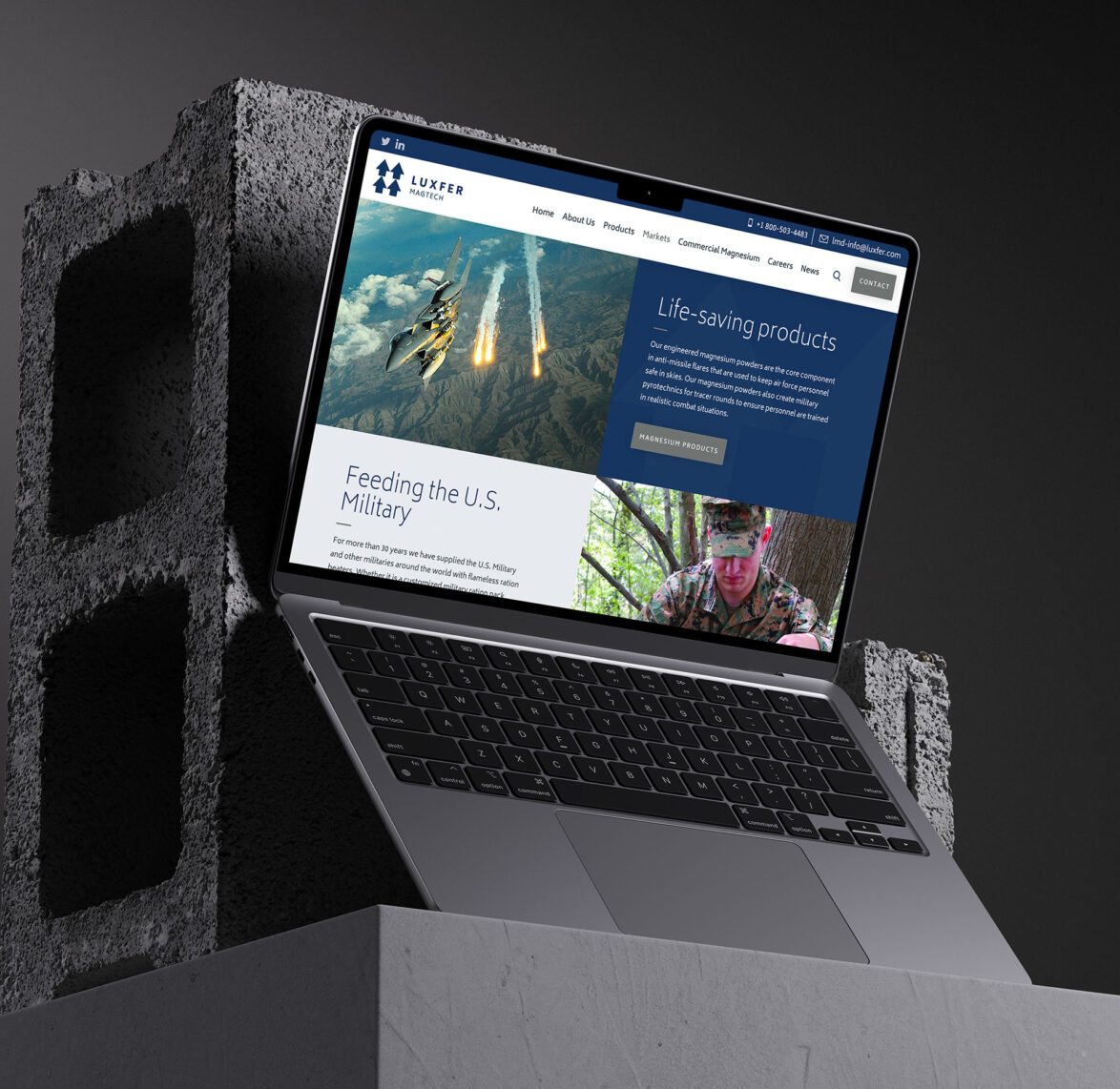
Luxfer Magtech
42% increase in form conversion rate from CRO
-
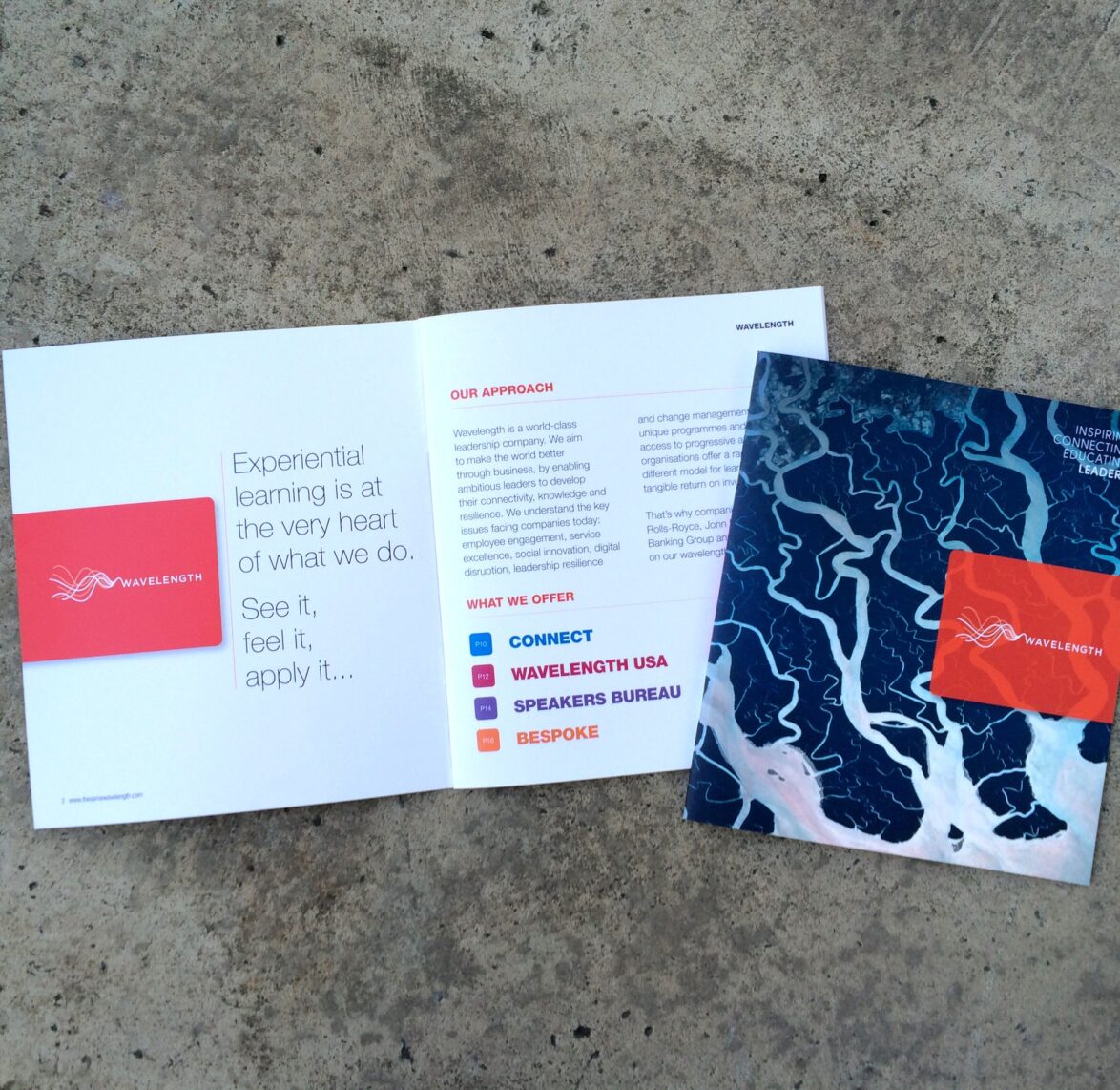
Wavelength
-
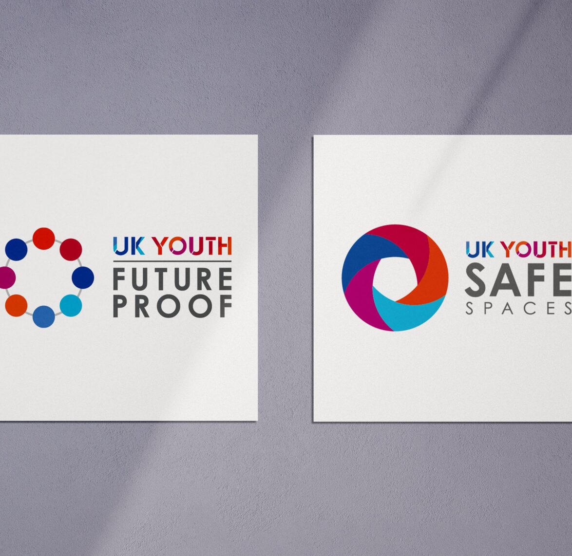
UK Youth – Brand Identities
-
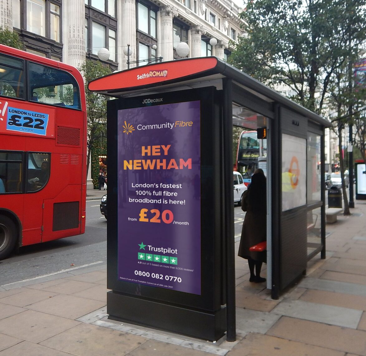
Community Fibre – OOH Advertising
-
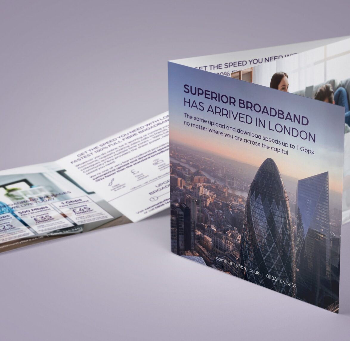
Community Fibre – Door Drop Advertising
-
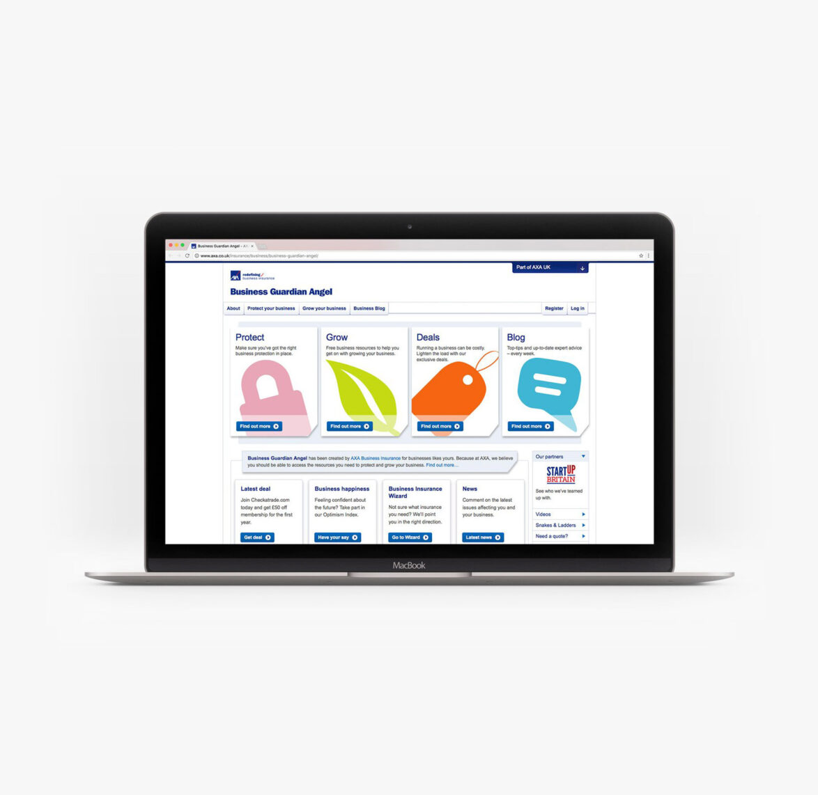
AXA – Marketing Collateral, Digital Ads & Microsite
-
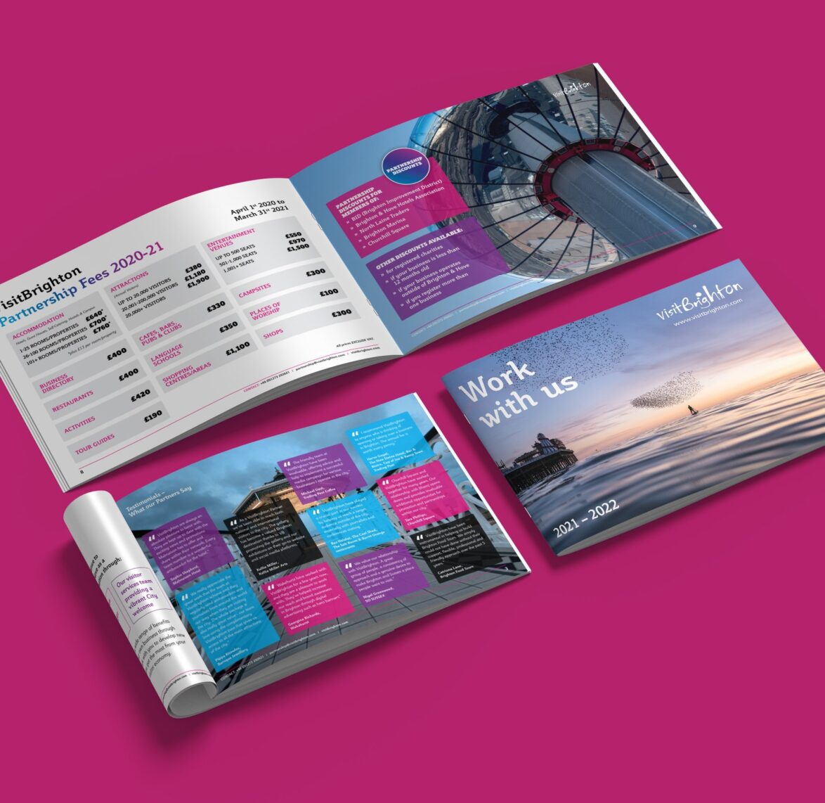
Visit Brighton – Media Pack
-
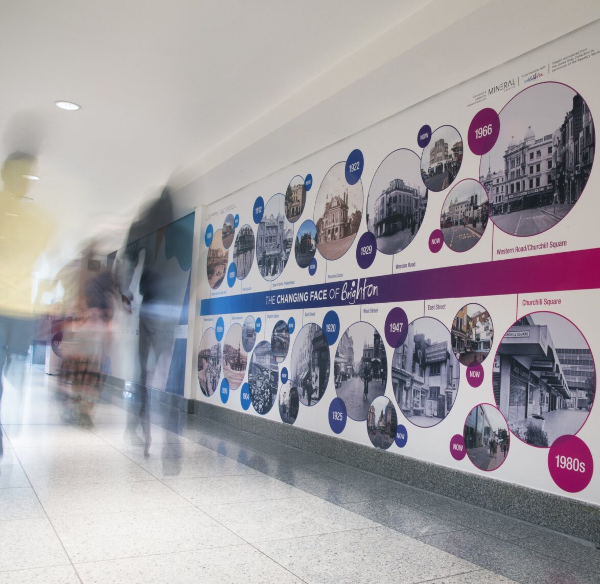
Visit Brighton – History Wall & Tourist Signage
-
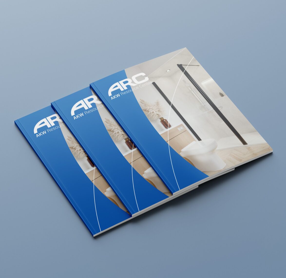
ARC – 2022 Product Catalogue
-
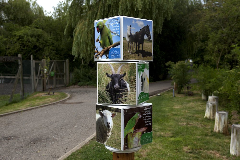
Raystede – Signage & Printed Materials
-
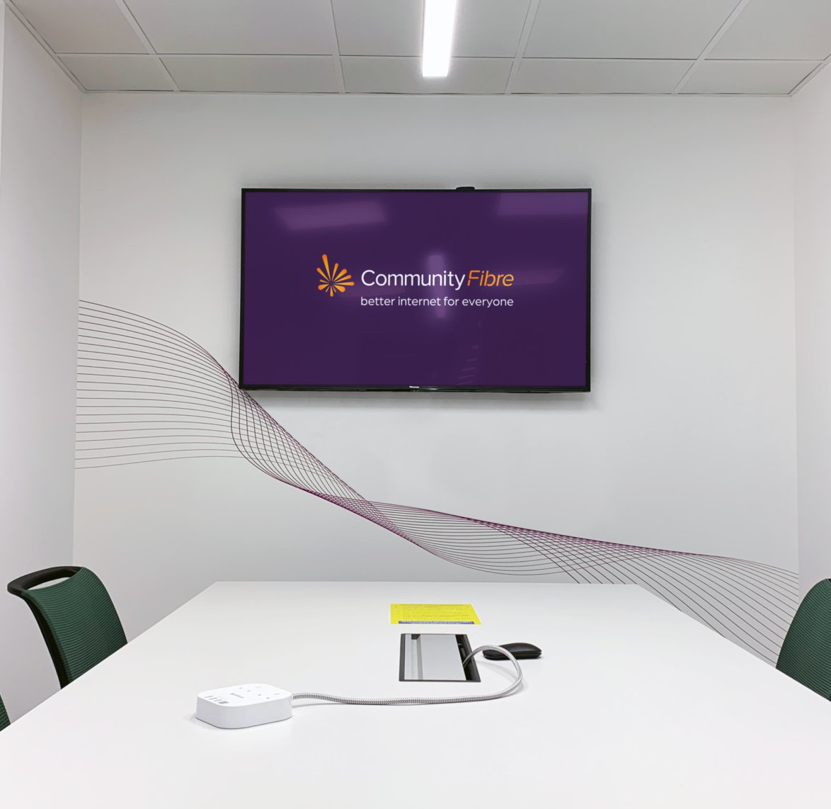
Community Fibre – Office Branding
-
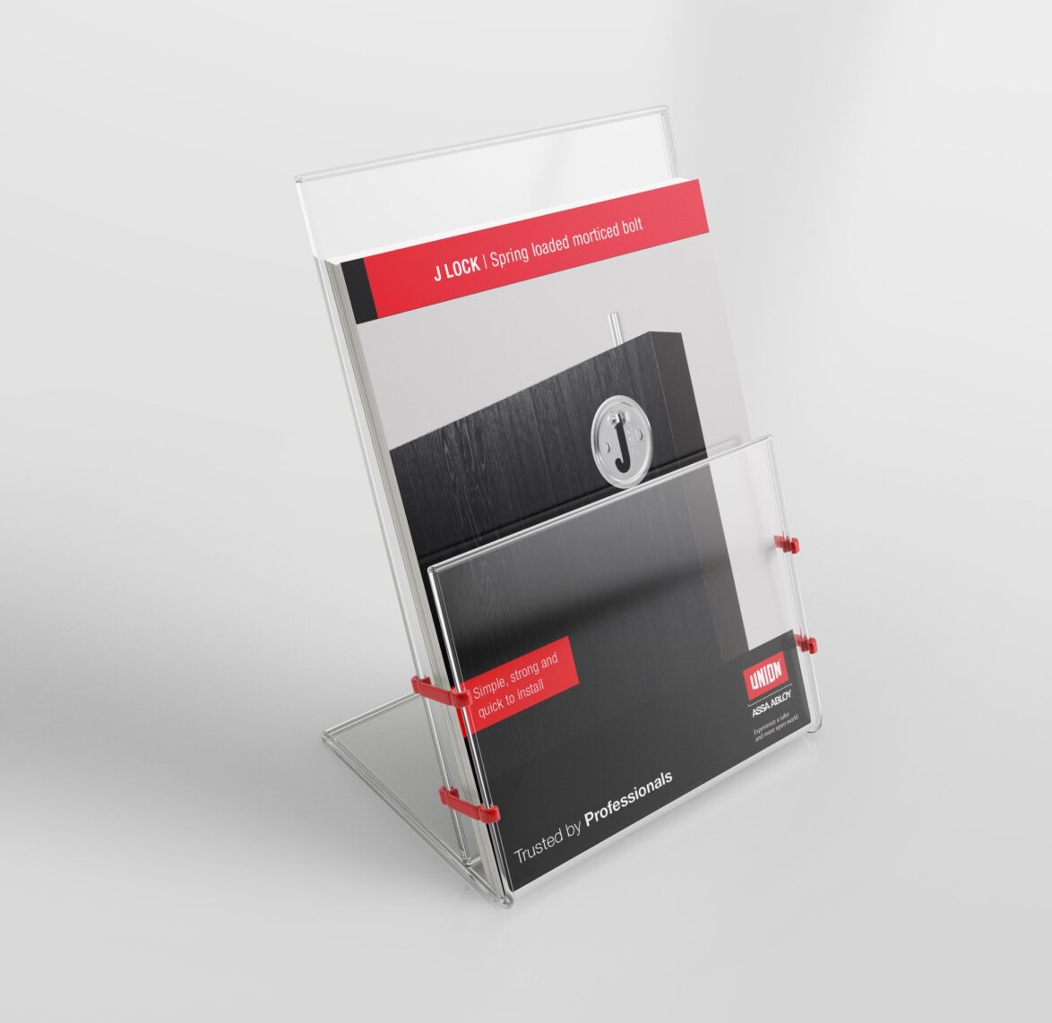
Assa Abloy
A global leader in the access solutions sector.
-
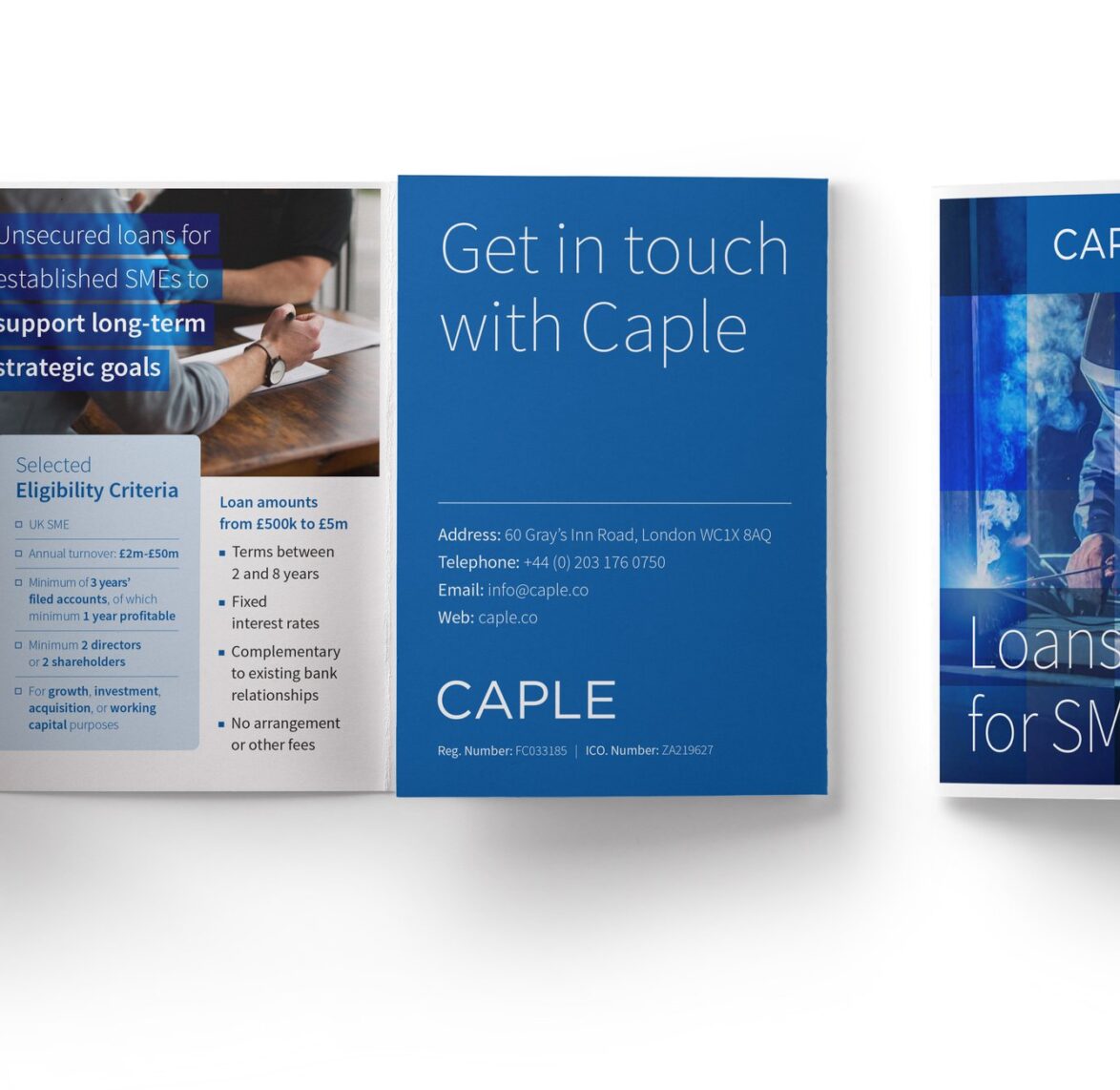
Caple – Brand identity
-
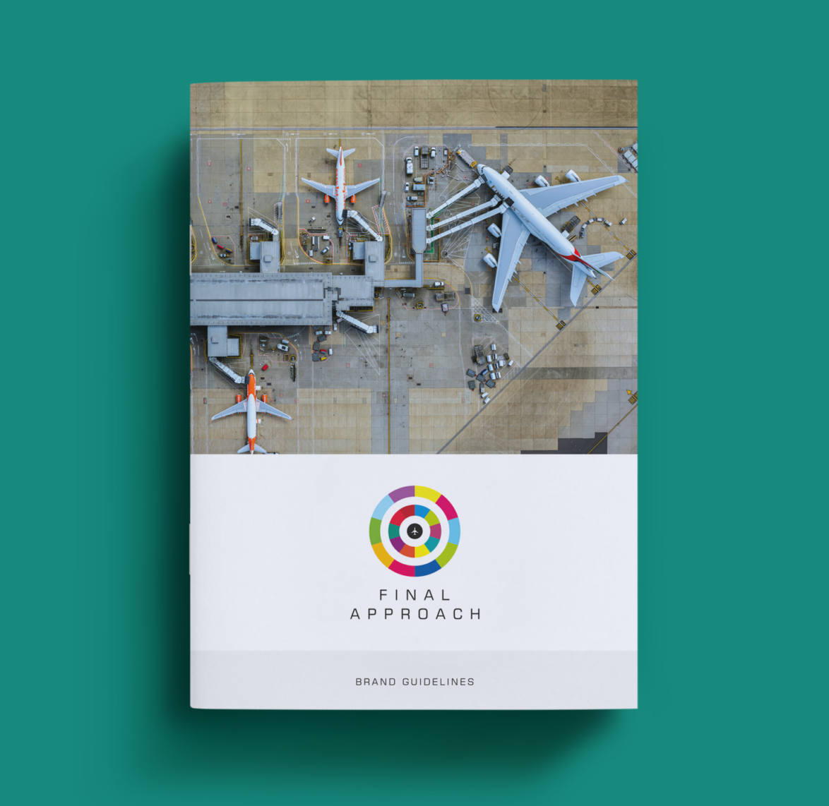
Final Approach – Brand identity
-
Premium Credit – Creative Review
-
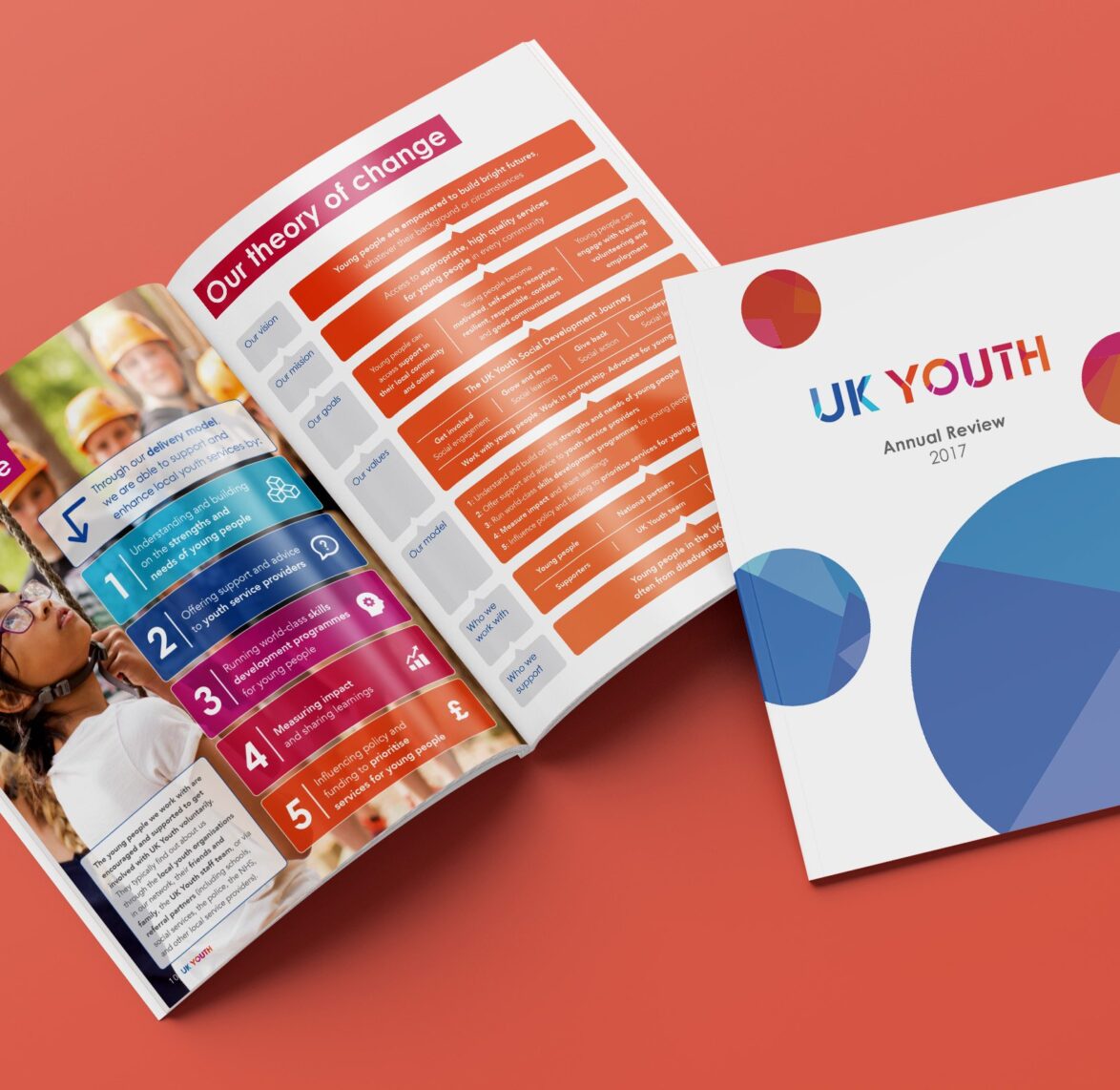
UK Youth – Annual Review
-
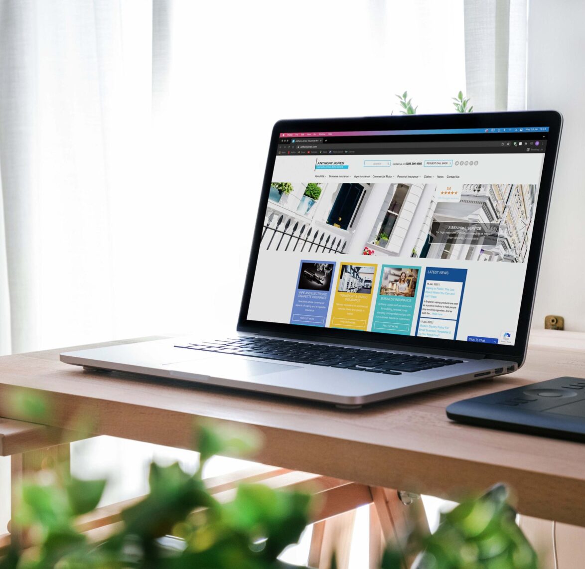
Anthony Jones – Website
-
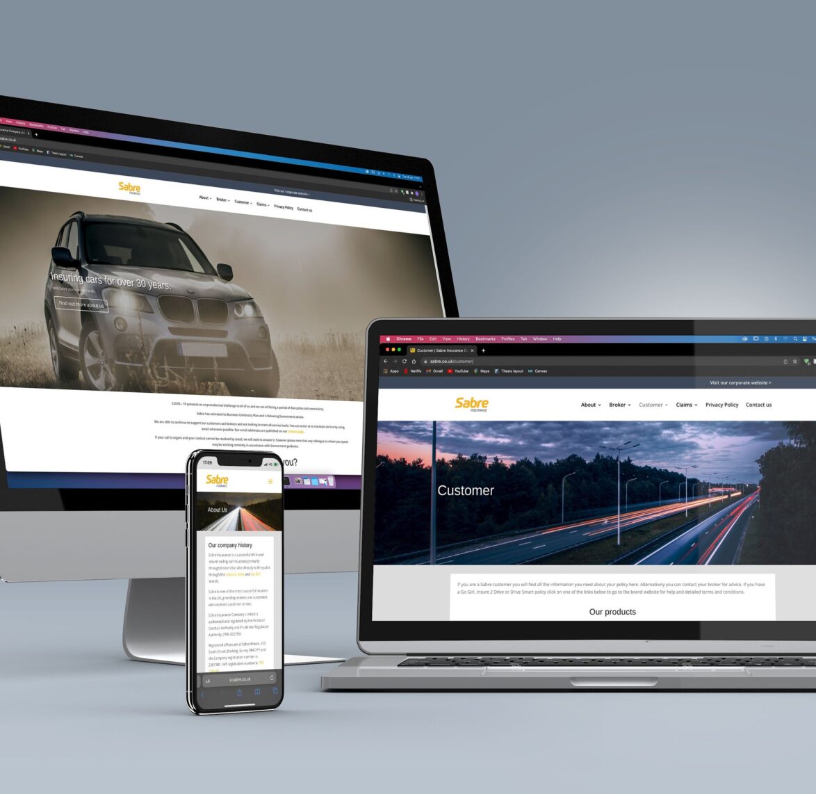
Sabre Insurance – Website
-
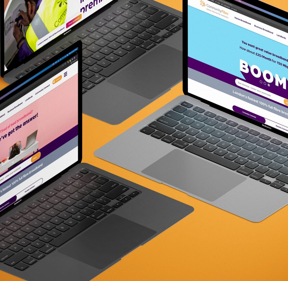
Community Fibre – Website
-
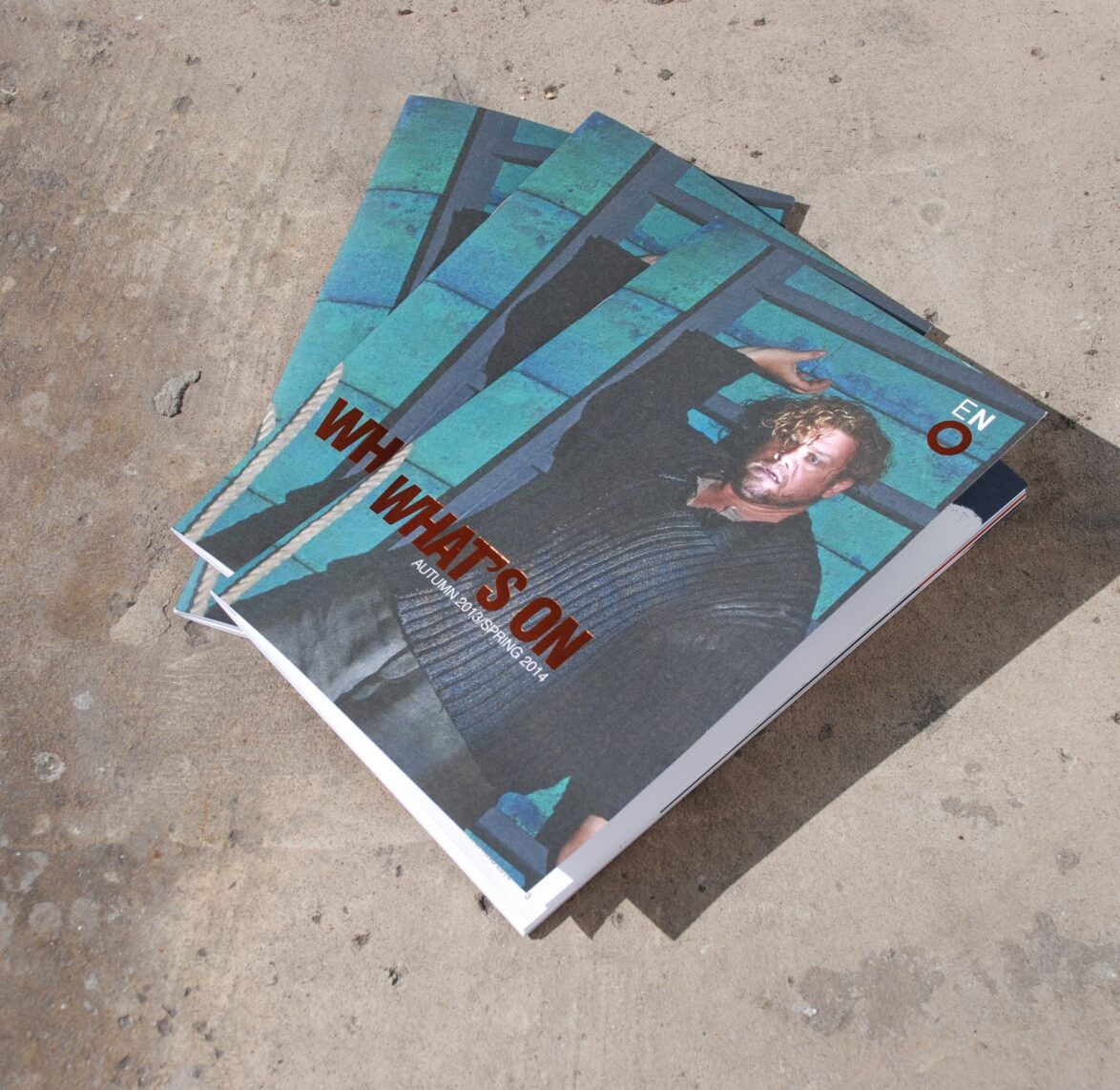
English National Opera – What’s On Guide
-
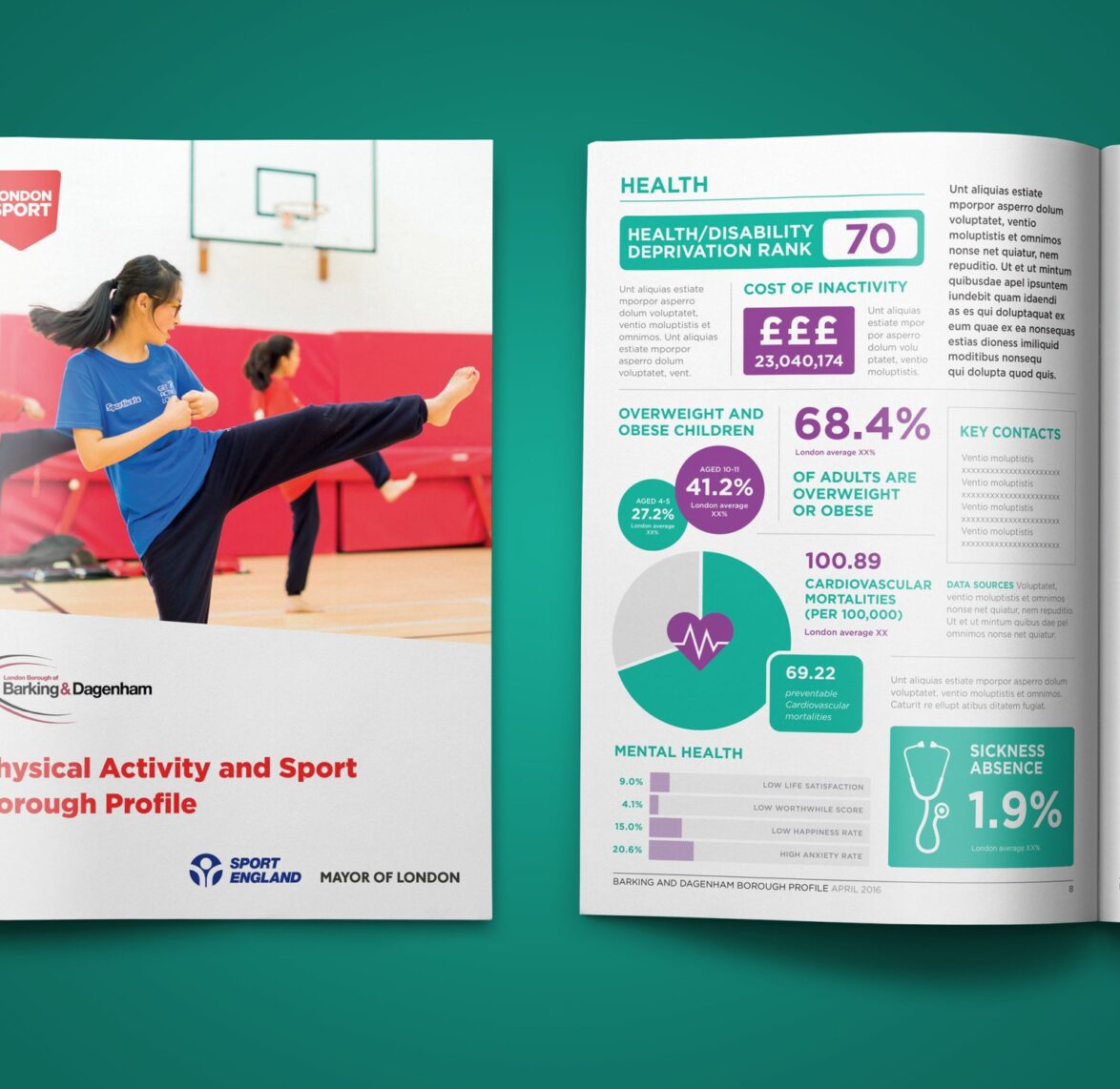
London Sport – Borough Report
-
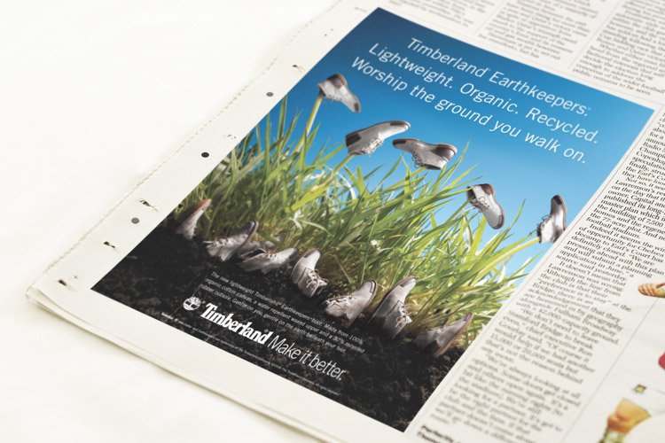
Timberland – ‘Earthkeepers’ Print Advertising
-
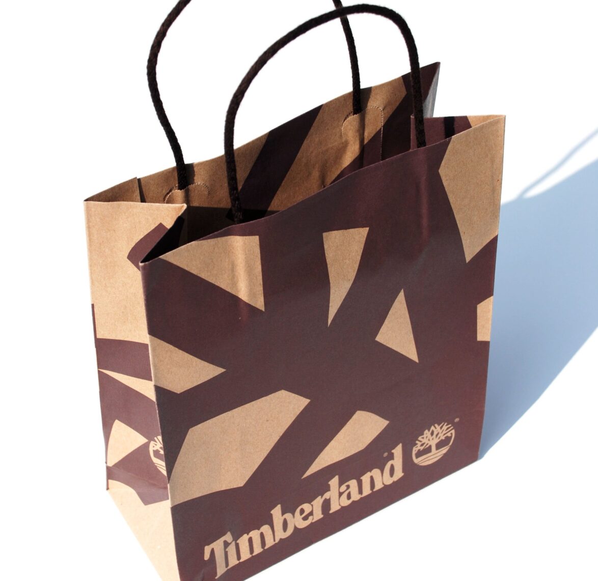
Timberland – Retail Bag
-
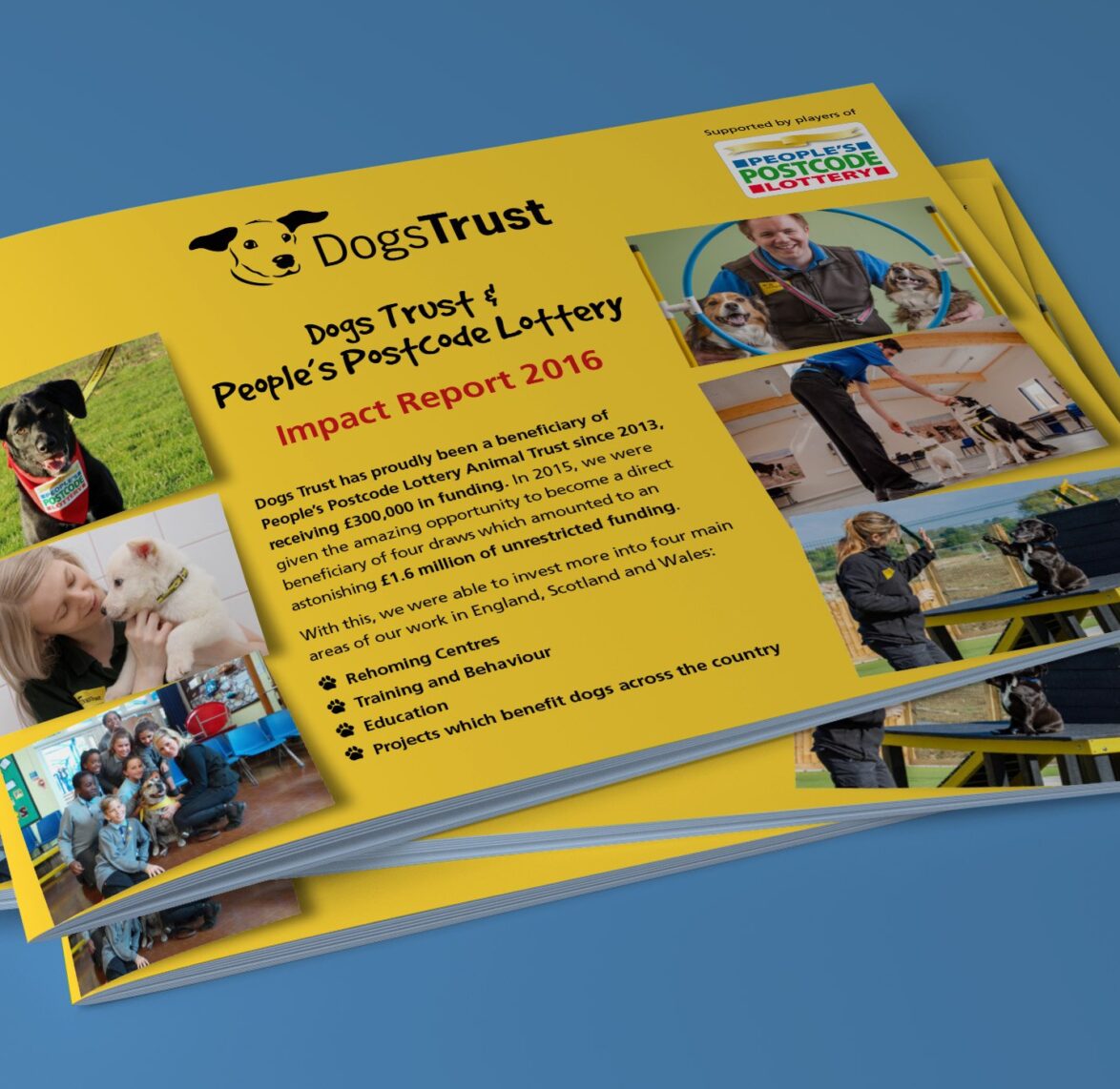
Dogs Trust – Impact Report
-
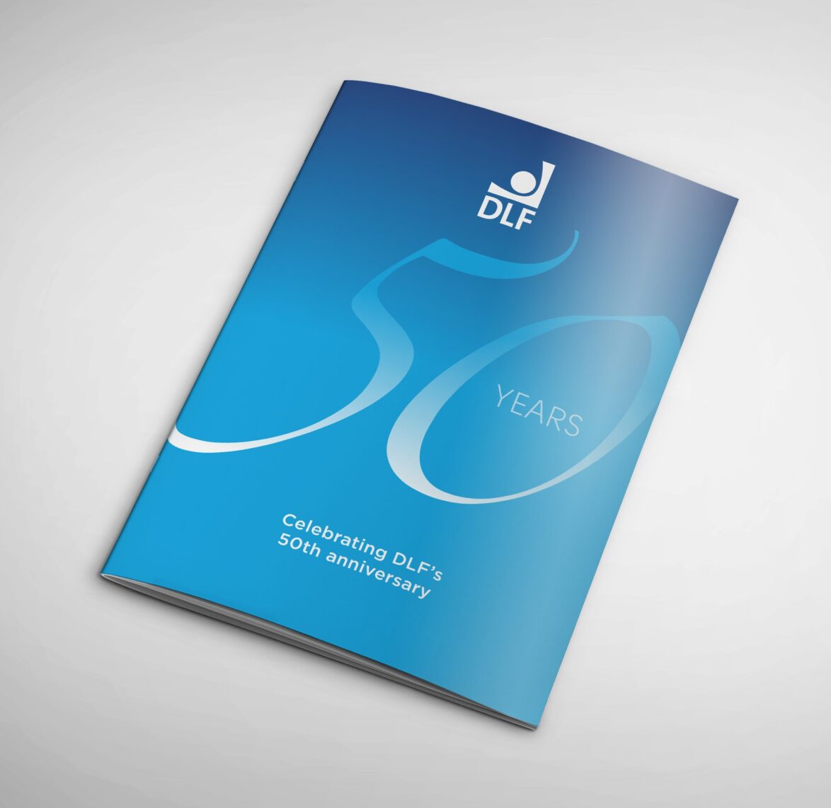
DLF – 50th Anniversary
-
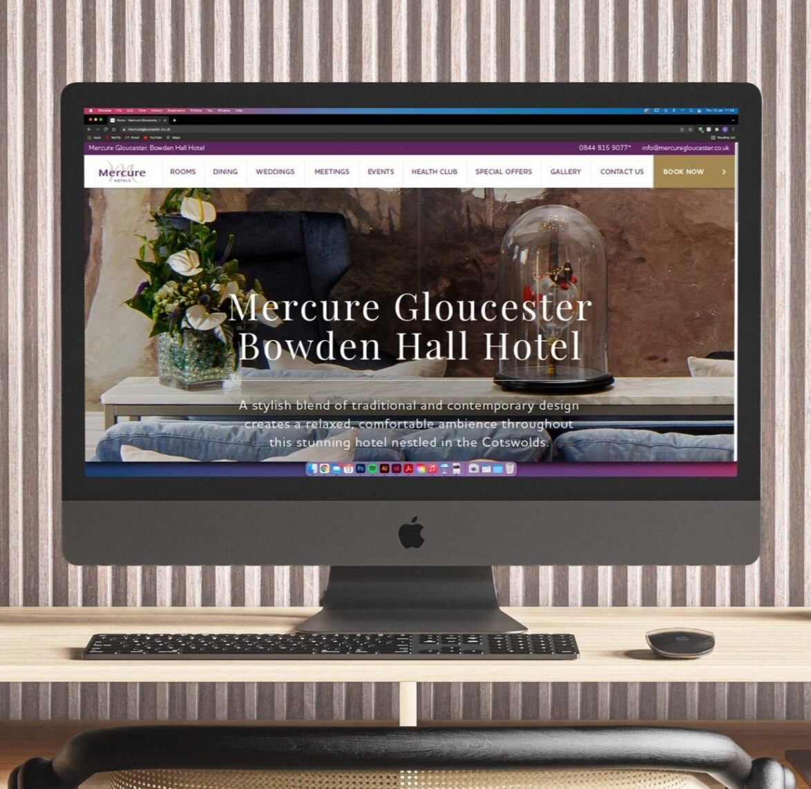
Mercure Hotels